Andrew Valentine

Mapping the Upper Mantle
12 August 2016
I was invited to write a piece for the ‘Paper of the Month’ feature on the EGU seismology blog. I chose ‘Mapping the upper mantle: Three-dimensional modeling of earth structure by inversion of seismic waveforms’, by John Woodhouse and Adam Dziewonski. The original blog post can be found here, and is reproduced below.
My choice for ‘paper of the month’ is an article that was published when I was only a few weeks old, yet which was also the starting point for my own research career. On my first day as a PhD student, John Woodhouse handed me the source code for a program called aphetinv, and told me to ‘see if you can work out what’s what’. Ten years later, I still don’t think I understand all the intricacies of the code, but I have come to appreciate the importance of the science that it underpinned.
“Mapping the upper mantle: Three-dimensional modeling of earth structure by inversion of seismic waveforms” (Woodhouse & Dziewonski, 1984) is one of the cornerstones of modern global tomography. For the first time, John and the late Adam Dziewonski showed how complete seismic waveforms could be used to construct a single image of the entire upper mantle. For most geoscientists today, raised on a diet of such pictures, it is perhaps hard to imagine how much of a revelation this was.
Of course, progress in science requires ‘standing on the shoulders of giants’, and imaging the Earth’s interior was not a new idea in 1984. In fact, it can be traced back at least as far as 1861, when Robert Mallet—a Dublin engineer, whose other major contribution to science involved rescuing the Guinness brewery when its water supply dried up1—published the first study documenting local variations in seismic wavespeed, for the area around the town of Holyhead, in Wales. In 1977, this crystallised into something recognisable to modern seismologists as regional travel-time tomography: Keiiti Aki, Anders Christoffersson and Eyestein Husebye were able to take P-wave travel times recorded underneath a small seismic array operated by Norsar, and recover seismic velocities in a three-dimensional arrangement of grid cells. The 1970s and 80s also saw much early work mapping global variations in mode eigenfrequencies, or in surface wave phase velocities, and then using these maps to infer details of Earth structure—and of course, 1981 marked the publication of PREM, the ‘preliminary’ reference Earth model.
Woodhouse & Dziewonksi’s work in Mapping the Upper Mantle built on these ideas, and on their other great joint contribution to global seismology (with George Chou, in 1981): the centroid–moment-tensor algorithm. This had extended earlier work by Freeman Gilbert and others, and showed how the mathematical expression for a seismogram as a sum of normal modes could be differentiated with respect to the various source parameters. Thus, these derivatives—nowadays often referred to as ‘sensitivity kernels’—could be used to drive an optimisation procedure which sought to match synthetic waveforms to observations. The logical next step—and the main theoretical contribution within the 1984 paper—was to derive similar expressions for partial derivatives with respect to structural parameters, and then apply the same procedure to obtain images of Earth’s interior.
For this to be computationally tractable, an efficient method for computing synthetic seismograms in laterally heterogeneous earth models was required. A simplifying assumption was introduced: the ‘path-average approximation’. In this framework, seismograms are sensitive only to the average structure encountered along the great-circle ray path between source and receiver. The resulting expression for a synthetic seismogram is very similar to Gilbert’s formula for normal mode summation in spherically-symmetric earth models, except that it has path-dependent perturbations to modal frequencies and source-receiver epicentral distances—and thus it could be implemented with relatively minor modifications to existing codes.
With the mathematical machinery in place, Woodhouse & Dziewonski took data from 870 source-receiver pairs, drawn from the new global networks—the International Deployment of Accelerometers programme, for example, had begun less than a decade before, in 1975. From the seismograms, handpicked windows were chosen that either contained mantle-sampling surface wave trains (which were filtered to contain signal at periods of 135s or more), or long-period body waves (45s period or longer). The result was some 3500 waveforms, which were used to constrain a degree-8 spherical harmonic model of the shear wave velocity structure in the mantle. In fact, two different models were presented in the paper: M84C, which incorporated prior information about regional crustal structure and was designated as the authors’ ‘preferred’ model, and M84A, which was determined entirely based on the data.
 When
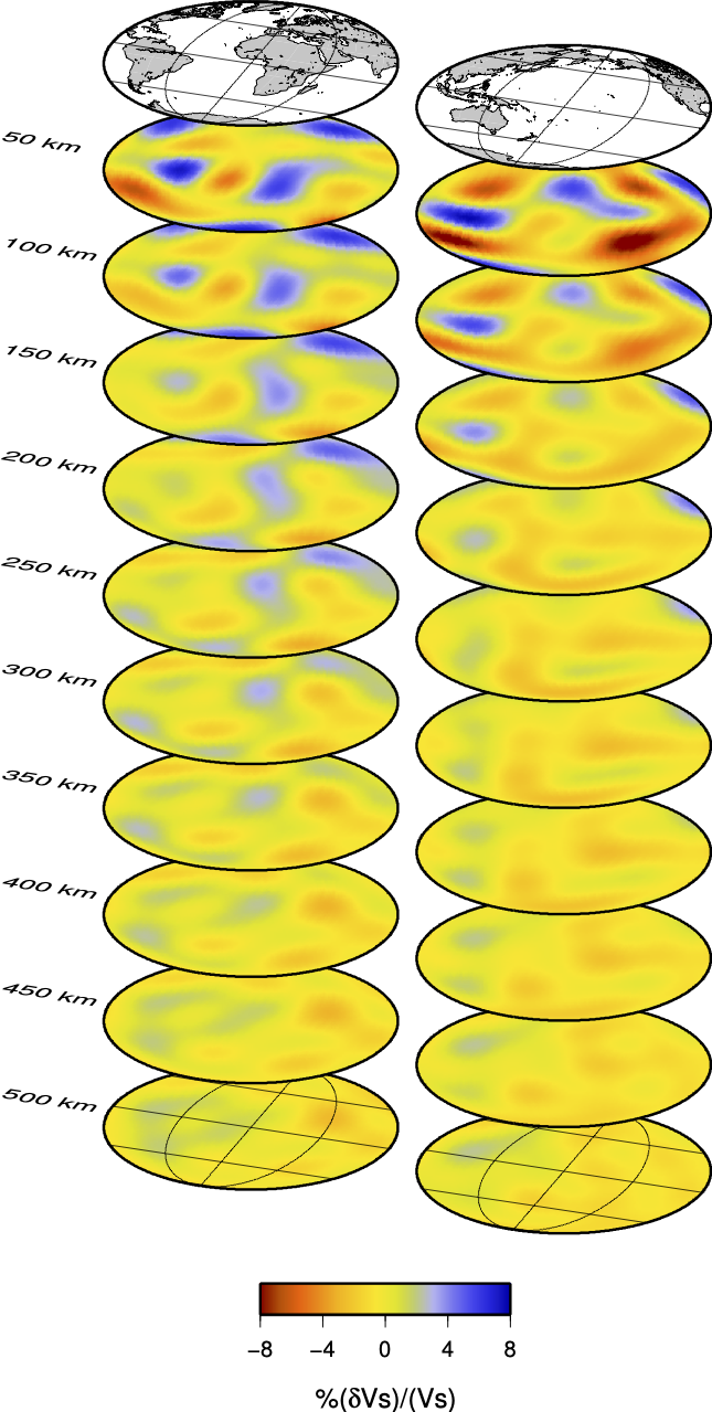
When M84C (left) is compared2 to current state-of-the-art models, it is clear that Woodhouse & Dziewonski managed to capture the large-scale structure of the Earth with remarkable accuracy. Over the intervening 32 years, the picture has been gradually refined by a succession of models produced by various groups, taking advantage of improvements in data and theory, and—above all—exploiting ever-increasing computational resources. The latest global models employ numerical wave propagation simulations that are (almost) physicially-complete, and are built from massive datasets with a far richer frequency content than those used in 1984. Plainly, the details in images have evolved, and model resolution has improved: the lateral features seen in M84C have a minimum length-scale of around 5000km, whereas SEMum, a recent high-resolution model, reports robustly-imaged structures that are about 1500km across. However, the large-scale picture has changed little, at least regarding the distribution of heterogeneity. Robust determination of the amplitude of velocity anomalies remains somewhat elusive, and current models have yet to reach a consensus.
In this context, it is interesting to note that one aspect of seismic tomography has remained fundamentally unchanged over the years: the formulation of the tomographic inverse problem. Progress has certainly been made—for example, adjoint methods provide an elegant and computationally-efficient route towards computing model updates, and offer the potential for exploring Earth at ever-finer scales. Yet just as in 1984, these techniques are based on an iterative, linearised approach towards minimising a relatively simple measure of the difference between synthetic and observed waveforms. Perhaps it is here that the next big development will be born.
What is it that makes this paper such an important milestone? Of course, one answer is that it gave geoscientists new insight into the Earth, but I think there is rather more to it than that. Mapping the Upper Mantle builds on three distinct strands of scientific development that had been growing rapidly through the 1960s and 70s: data and instrumentation; the theory of seismic wave propagation; and computation, especially numerical linear algebra. By a combination of vision and technical ingenuity3—plus the good fortune of being in the right place at the right time—Woodhouse & Dziewonski were able to draw all three together, heralding a new era of global seismology as a data-driven, computationally-intensive field.
There is another reason why this paper stands out as a turning point: pretty pictures4. The colour plates accompanying Mapping the Upper Mantle were groundbreaking5, and an immense undertaking—all the software to generate them had to be written from scratch, which apparently took almost as much effort as developing the inversion code itself! Before 1984, papers on Earth structure had typically been illustrated with black-and-white contour plots; since then, colourful depth slices and cross-sections have become ubiquitous. Again, this owes as much to technological advances as to the influence of any one paper. But by using cutting-edge tools to tackle an ambitious question, and then presenting the results in an attractive, eye-catching way, Woodhouse & Dziewonski were able to shape the course of research in the geosciences for many years to come.
-
See this biographical sketch of Mallet and his father. ↩
-
For a helpful compilation of recent tomographic models, shown side-by-side and on the same colour scales, see figures 13–19 of this monograph chapter by Andrew Schaeffer and Sergei Lebedev. ↩
-
To those of us who are used to the luxuries of modern code development—optimising compilers, visual debuggers, and readily-available libraries to deal with most of the mundane stuff—it is difficult to over-state the scale of their task. A huge amount of creativity had to be employed to ensure that the software could run within the constraints of available memory, and the inversion algorithm had to assimilate individual seismograms sequentially, since they could only be stored on magnetic tape. As a demonstration of the (lost?) art of creative F77 coding,
aphetinvis a masterpiece—and, consequently, almost impenetrable. ↩ -
Although the prize for best illustration in a seismology paper must surely go to another work by Mallet, for his hand-drawn coastal cross-section, complete with a three-masted clipper about to encounter some unexpectedly large waves. ↩
-
However, the most instantly-recognisable images actually come from a follow-up paper in Science, showing the Earth with one quadrant cut away, and its inner secrets revealed. ↩